Martina Pivetta, Head of Data Visualization
As the head of the Data Visualization Department in our esteemed company, I welcome you to a journey that transcends conventional data interpretation. In the realms of travel and real estate, data is omnipresent, yet making sense of it requires finesse, innovation, and the power of visualization. Today, we’ll deep dive into the transformative journey of raw data to interactive dashboards, spotlighting the immense value that this evolution bestows upon our partners and clients.
A Prelude: The Complexity of Raw Data

The journey commences with a seemingly daunting array of raw data. Imagine a comprehensive dataset featuring prices across myriad companies for the upcoming 12 months. This intricate labyrinth also includes a tapestry of supplementary information for each price point. To extract meaningful insights, you’re faced with an overwhelming conundrum. It’s at this crossroads that data visualization takes center stage.
The Evolution: A Visual Symphony

Embarking on this transformative journey, we translate raw data into an intuitive and insightful language. Witness how the once cryptic array of numbers and information blossoms into a symphony of visual representation. The transition from “pre” to “post” is akin to an artist transforming a blank canvas into a masterpiece – a blend of creativity, precision, and innovation.
The Comparison: From Raw to Refined
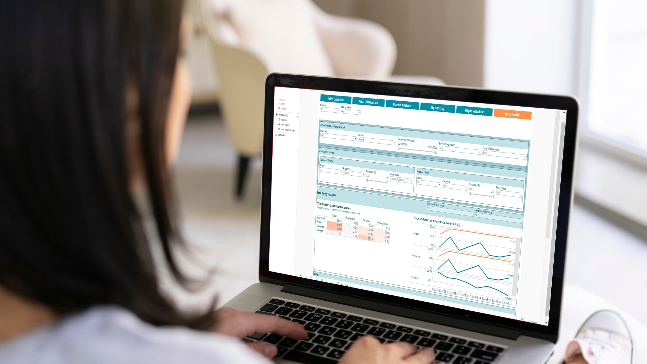
As the pre-post example above illustrates, the leap from raw data to interactive dashboards is monumental. It’s a journey that encompasses meticulous data transformation, user interface design, data flow orchestration, and more. The benefits, however, are boundless.
In the “pre” stage, raw data presents a formidable challenge – an ocean of numbers that conceals opportunities and insights. Navigating this sea is akin to finding a needle in a haystack. Without the aid of visualization, the journey to valuable insights is arduous and time-consuming. Decisions are based on fragmented, unprocessed data, leading to uncertainty and suboptimal strategies.
Now, shift your gaze to the “post” image – an interactive dashboard designed to empower your decisions. Here, insights that once seemed elusive are crystal clear. An elegant user interface guides you through layers of data, revealing trends, patterns, and opportunities at your fingertips. The complexity of raw data is distilled into easily digestible visual elements, providing a panoramic view of your landscape.
The Power of Interactive Dashboards
The beauty of interactive dashboards lies in their ability to facilitate data-driven decisions. Every interaction peels back layers of information, empowering you to fine-tune strategies, optimize pricing, and stay competitive. The seamless journey from a perplexing dataset to actionable insights is a testament to the power of data visualization. It’s a symphony that orchestrates data, design, and technology to provide you with a transformative advantage.
Conclusion: Navigating the Transformation
As we traverse the chasm from raw data to refined insights, we’re reminded that this evolution is far from trivial. It’s a journey that demands expertise, creativity, and dedication. The “pre” and “post” comparison underscores the magnitude of this transformation – a journey from confusion to clarity, from uncertainty to empowerment.
Our commitment as the Data Visualization Department is to bridge this divide, transforming complex data into strategic assets. Through interactive dashboards, we empower you to harness insights effortlessly, make informed decisions, and outshine the competition. Together, let’s continue to illuminate the path from data to wisdom, shaping a future where insights are not just hidden gems but easily accessible treasures.


